Projects


Recent Work.
Must explain to you how all this mistaken idea pleasure born and give you a complete account.
Creative Portfolio HTML5 Template
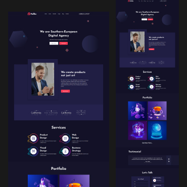
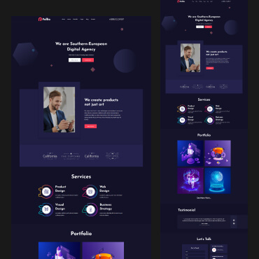
Graphics Design Folio – Multipurpose Portfolio HTML5 Template
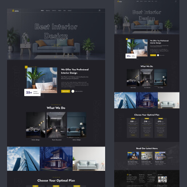
Portfolio Template Architecture & Interior WordPress Theme
Architecture / Business


Latest News
Must explain to you how all this mistaken idea pleasure born and give you a complete account.